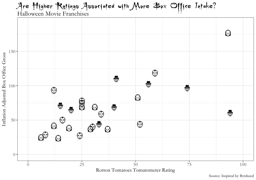
./assets/body-header.qmd
I am spring cleaning my computer and have a couple PNG files of plots I made that I want to adios. So, I thought to myself, “self…why don’t you put these on a blog post before you trash them forever.” It sounded like a good idea at the time, so here they are.
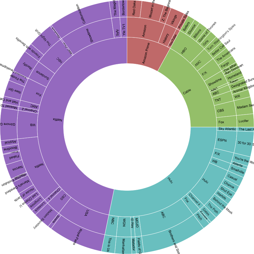
This second plot is a sunburst plot I created for the data visualization course. If I remember right, this was created using my annual TV watching data from 2017 and made using RawGraphs.
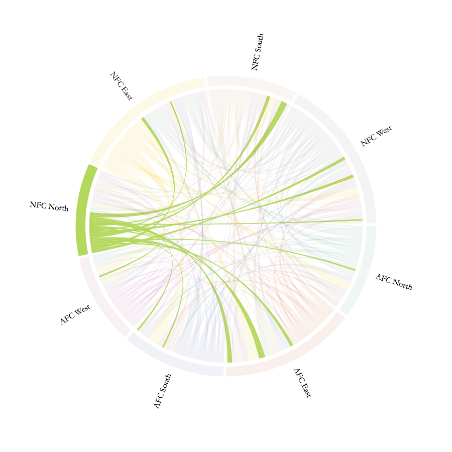
Here is a plot from a set of plots I created years ago to show whether NFL players were being traded to teams within the same conference or elsewhere.
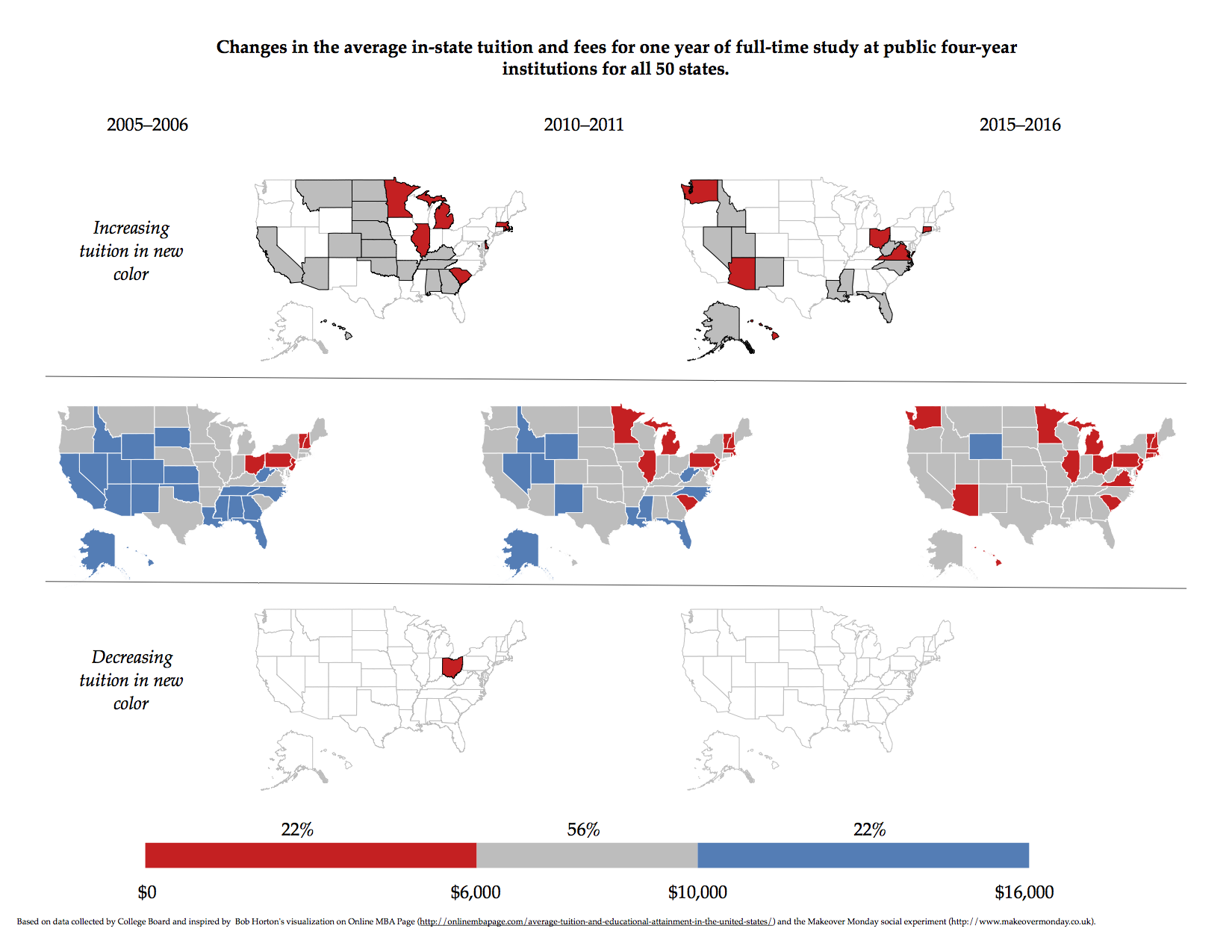
This is a micromap I created showing tuition changes over a three-year span. This was inspired by content in the book Visualizing Data Patterns with Micromaps, which I read a few years ago. I wanted to try some of what they were doing, so I ultimately created each map using R and then put them all together onto a single graphic with Keynote. Probably could do this now with Patchwork.
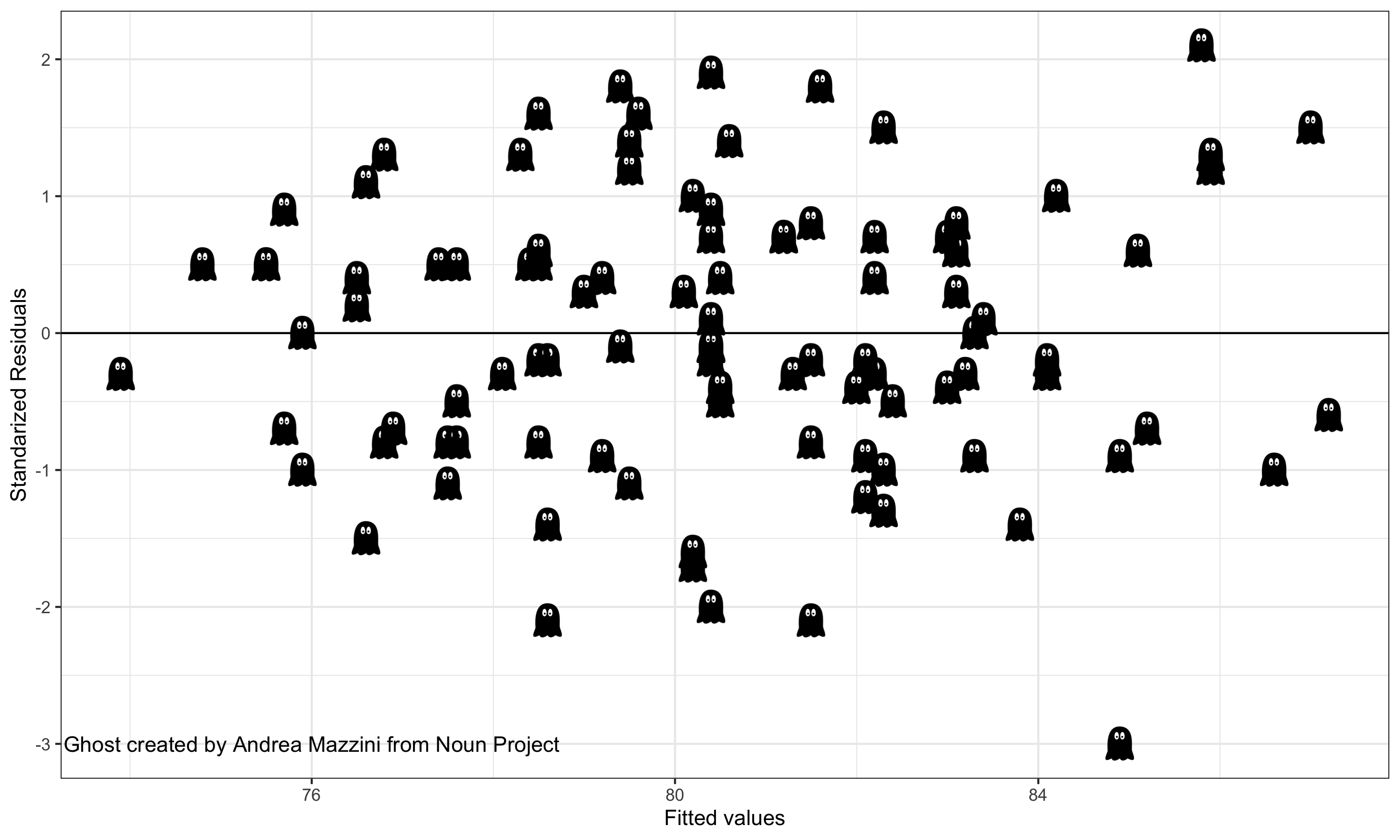
Finally, here is a residual plot I created for a set of regression notes where we were talking about model assumptions right near Halloween.